Website with Responsive Design Explained with Images
 Author: Giuseppe Romanazzi
Updated on March 12, 2025
Summary: A modern website doesn’t always appear the same but adjusts to different screen sizes to enhance both its aesthetics and usability.
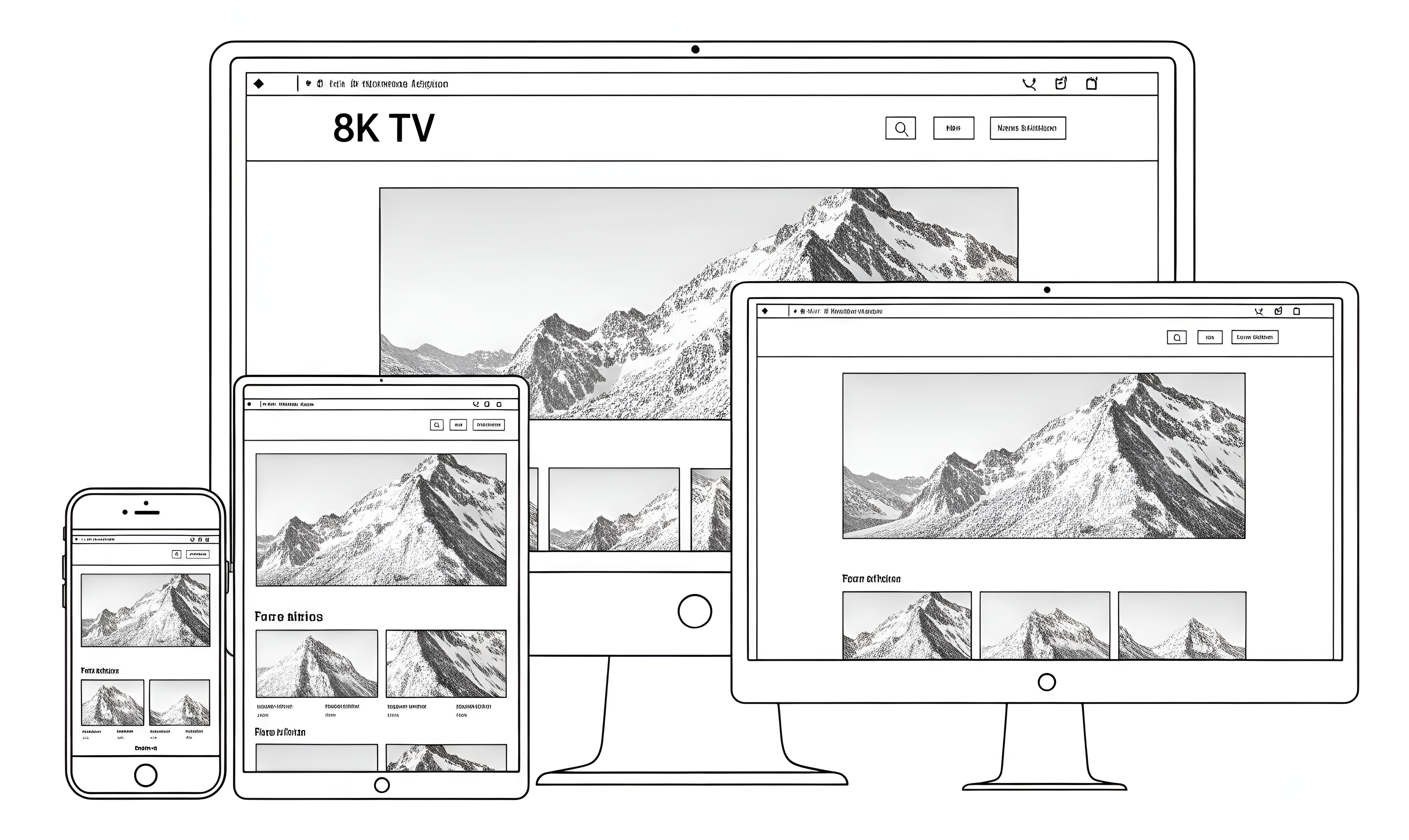
We have already explained, in words, what a responsive website is and how it adapts to the screen size used to view it.
Now, however, we will repeat the same concepts, but this time using a series of images that practically show how the appearance of a responsive website changes as screen sizes vary.
Here we are, holding our small smartphone. In Figure 1, you can see how the homepage of the bbcs.it/en/ website appears when opened on a small-sized phone.
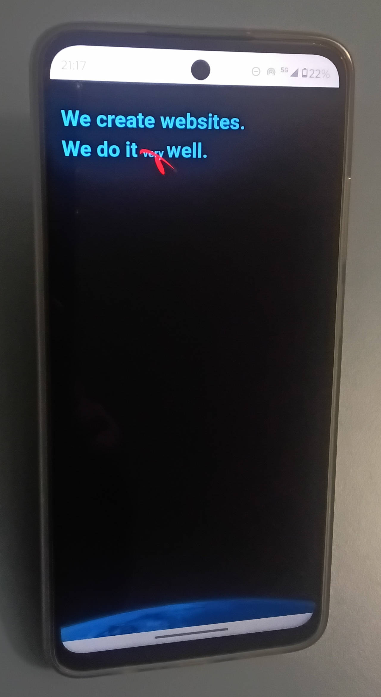
As you can see, the black background covers the entire screen until, as you scroll down, the logo reveals the word "very" and then flies away.
The text and logo sizes automatically adjust to the screen width. The text font size is approximately 29 pixels, with a line height of 140% (about 40 pixels). The logo width is 103 pixels.
Here, the smartphone is held vertically. But what happens if we rotate it horizontally? In the figure below, you can see how the same page adapts to the new dimensions.
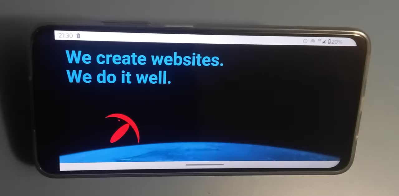
The black background, once again, covers the entire screen, even though this screen is significantly shorter in height than the previous one.
The text and logo sizes have also adjusted to fit the new screen. This time, the logo's width is approximately 206 pixels, and the text's font size is about 50 pixels. However, the line spacing has not increased proportionally, as the website has taken the reduced screen height into account and consequently adjusted the line spacing to 110% (around 55 pixels).
To accommodate the smaller screen height, the website has also shifted the text slightly upward and the picture of the planet Earth slightly downward.
But there's more. Scrolling further down the same page, we reach the section shown in the following figure.
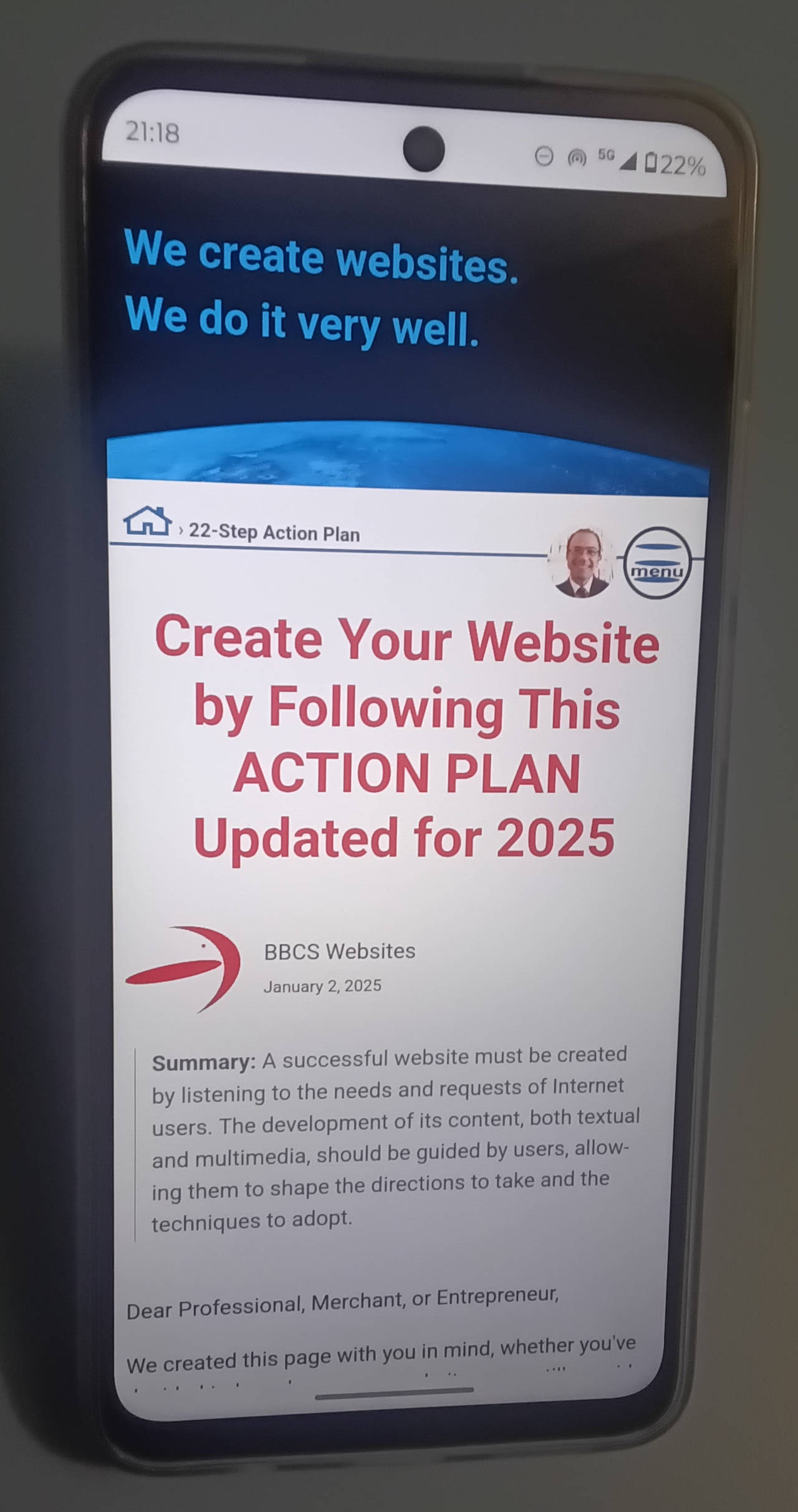
The first thing to note is that, in addition to the help button, there is also a button in the top right corner to display the website's menu. The decision to use a button instead of displaying the menu directly is due to the limited space available on such a small screen.
In this picture, we can also observe that the title is approximately 39 pixels in size (with a line height of about 46 pixels), while the paragraph text is 16 pixels (with a line height of 24 pixels).
By holding the smartphone in landscape mode, we can see how this part of the page adjusts as well.
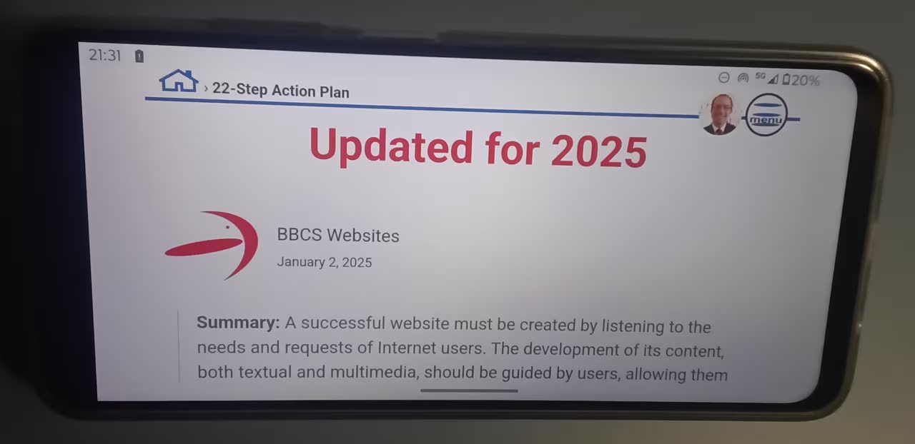
Following the same principles outlined in Figure 2, the elements in this part of the page also automatically adapt to the reduced height of the device. In particular, the fixed top bar is minimized as much as possible to provide more space for the most important elements.
The fonts and line heights of the subtitles and paragraph texts are proportionally adjusted to optimize the reading experience.
Now, let's switch devices. We'll move to a tablet and, as before, begin by holding it in portrait mode.
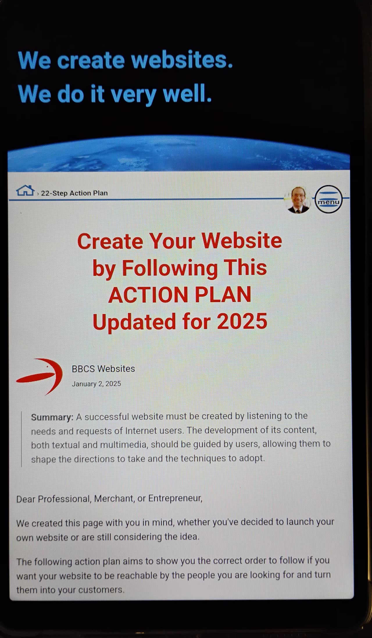
Just like with the smartphone, the website page will adjust again when we rotate the tablet to landscape mode.
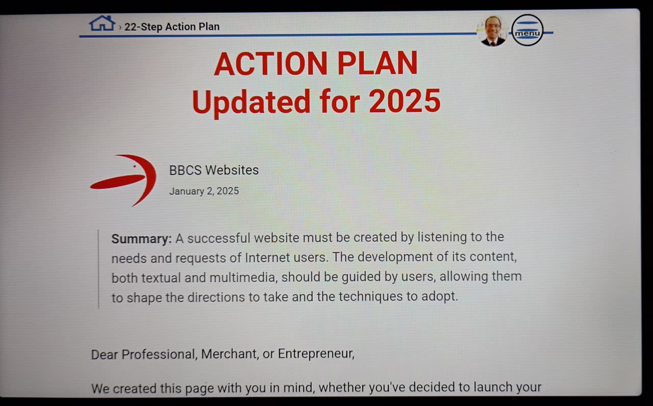
Another key aspect is the length of the text lines. As you may have already noticed in Figure 4 (the smartphone in landscape mode), the text does not extend across the entire width of the device but is limited to a maximum of about 70 characters. This prevents what we like to call the "tennis match effect."
Observing how the website adapts to different window sizes in Windows is even more intriguing. The following two figures illustrate this process at different stages.
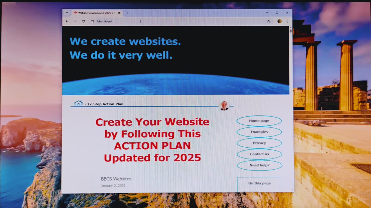
As we expand the Windows window, the large blank spaces on either side of the text will be noticeable until the window width (1045 pixels) becomes sufficient to accommodate the menu.
Further enlarging the window will dynamically adjust the white spaces, ensuring a consistently proportionate and visually appealing design up to a width of 1200 pixels, as shown in Figure 8.
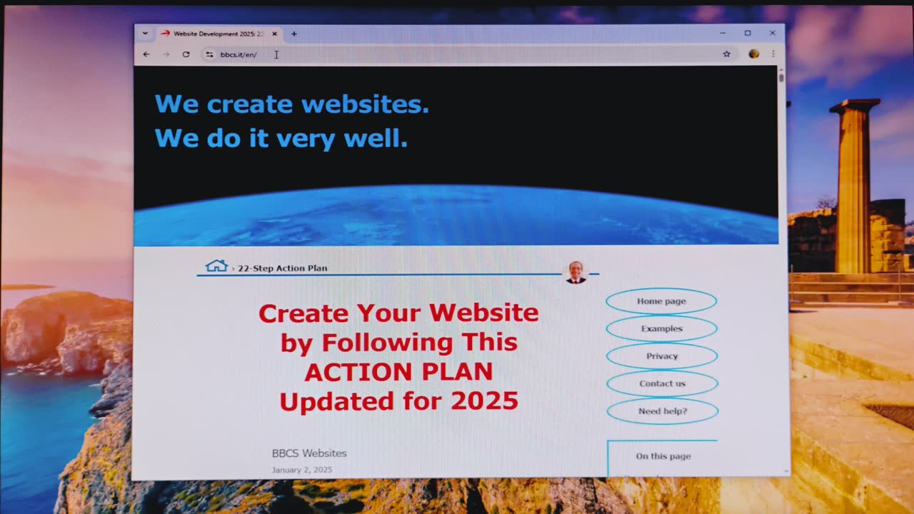
From 1200 pixels onward, the proportions of the page elements remain the same, no matter how large the screen gets. The only significant limitation is the size of raster images (which, in Figure 8, are the planet Earth and Giuseppe’s face), as they can currently be displayed correctly only up to an 8K TV.
Everything we have seen so far could also be simulated using the "device toolbar" in Chrome DevTools. With it, you can adjust the screen size to any value, including those of a 4K or 8K TV.
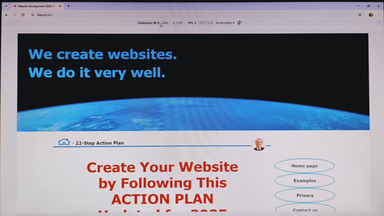

Aside from raster images, the rest of the website's design would adapt perfectly to any resolution beyond 8K. Even vector images, such as the menu button icon, would scale to any size while maintaining maximum quality.
So, we'll conclude here. There are many other adjustments that specific designs must implement to be truly responsive. However, we will analyze them when we cover the topic of "Design and Special Effects."


Share this page:
As an alternative to the buttons above, you can select the following address, and copy/paste it into the message to send on your favorite social network:
https://bbcs.it/en/how-to-build-a-professional-website/responsive-design/responsive-design.html