Website Redesign & SEO+UX: Avoid Traffic Drops, Keep Your Supporters Happy
 Author: Giuseppe Romanazzi
Updated on September 18, 2025
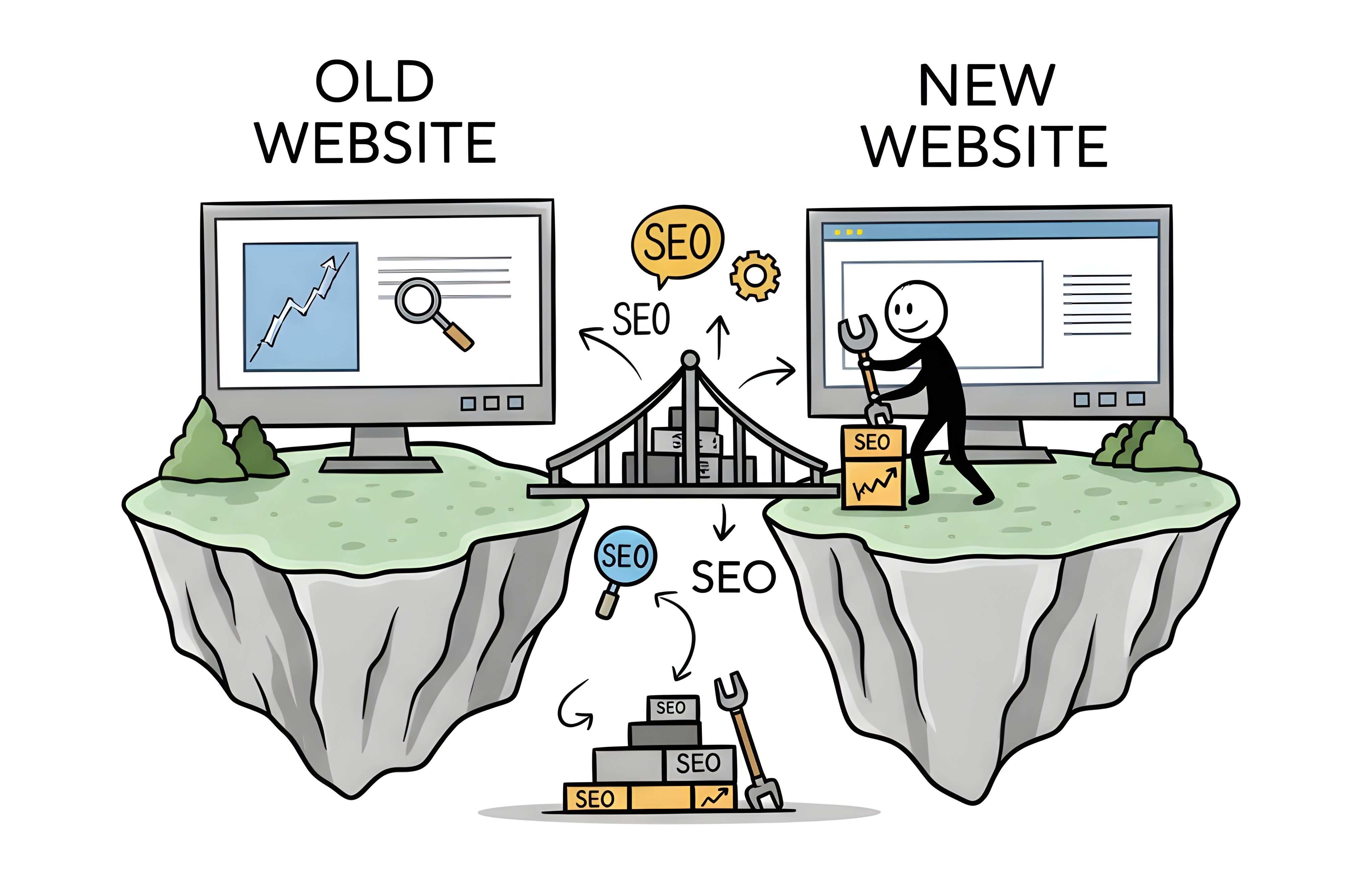
Short summary: Redesigning a live website is risky—it’s not a blank canvas. Many redesigns cause traffic loss, not because of bad visuals, but due to careless changes to content, SEO structure, and user flow. To avoid this, follow the BBCS Redesign Approach™:
- Identify what already works
- Protect it
- Change one thing at a time
- Keep proven elements
- Reuse them cautiously elsewhere
- Monitor closely post-launch
- Involve an SEO expert
Long summary
Website redesign is risky. You’re not starting from scratch—you’re working with a live website, so don’t treat it like a blank canvas. To avoid common (and costly) redesign mistakes, keep these key points in mind:
- Don’t redesign everything at once [Read more].
- Don’t redesign just because it looks old [Read more].
- Trendy ≠ Effective [Read more].
- Your designer’s preferences shouldn’t drive decisions [Read more].
- Even replacing an image can affect SEO [Read more].
- Changing headings is especially risky [Read more].
- Changing content significantly? That’s a risk too [Read more].
- Keeping the same URLs doesn’t make you safe [Read more].
- Google won’t just adapt to your changes [Read more].
Handle critical SEO elements with extreme care: Title tag, meta description, headings, URL structure, and page content.
Follow the BBCS Redesign Approach™ to reduce risk and improve performance:
- Step 1: Identify What’s Working [Read more]
- Step 2: Protect What’s Already Working [Read more]
- Step 3: Change One Thing at a Time [Read more]
- Step 4: Keep What Works [Read more]
- Step 5: Apply It Elsewhere (with Caution) [Read more]
- Step 6: Monitor Closely After Changes [Read more]
- Step 7: Consider Working with an SEO Expert [Read more]
This approach applies even when:
- You want a complete fresh start [Read more]
- You’re under pressure to meet a launch deadline [Read more]
- You’re rebranding or merging [Read more]
- You think “nothing’s working anyway” [Read more]
- You saw someone else do it—and it looked great [Read more]
- The new design just “feels better” [Read more]
Still not convinced? Learn from real-world failures:
- Gawker Media Redesign (February 2011)
- Digg v4 Redesign (August 2010)
- Marks & Spencer E-Commerce Redesign (2014)
- StumbleUpon Redesign (December 2011)
- Anonymous Reddit & Google Support Cases
And beware: Top YouTube videos on “website redesign” often ignore SEO entirely. Reviewed examples:
- “Website Redesign: Good to Great” – Matt Brunton
- “Small Business Website Redesign” – Maddy Beard
- “From Vintage to Modern Website Redesign” – Ran Segall
- “Website Redesign #3 | Clean and Premium” – Ran Segall
The bottom line: Don’t join the ranks of SEO Killers. Redesigns must protect what’s working—not gamble with it.
#BBCS #BBCSWebsites #BBCSRedesignApproach
What Are the Common Pitfalls of Website Redesign?
Many designers and business owners embark on a website redesign journey with fundamental misunderstandings about how search engines perceive and process website changes. These misconceptions, often born from a lack of SEO awareness (and sometimes designer overconfidence), are frequently the root cause of significant traffic loss and visibility declines.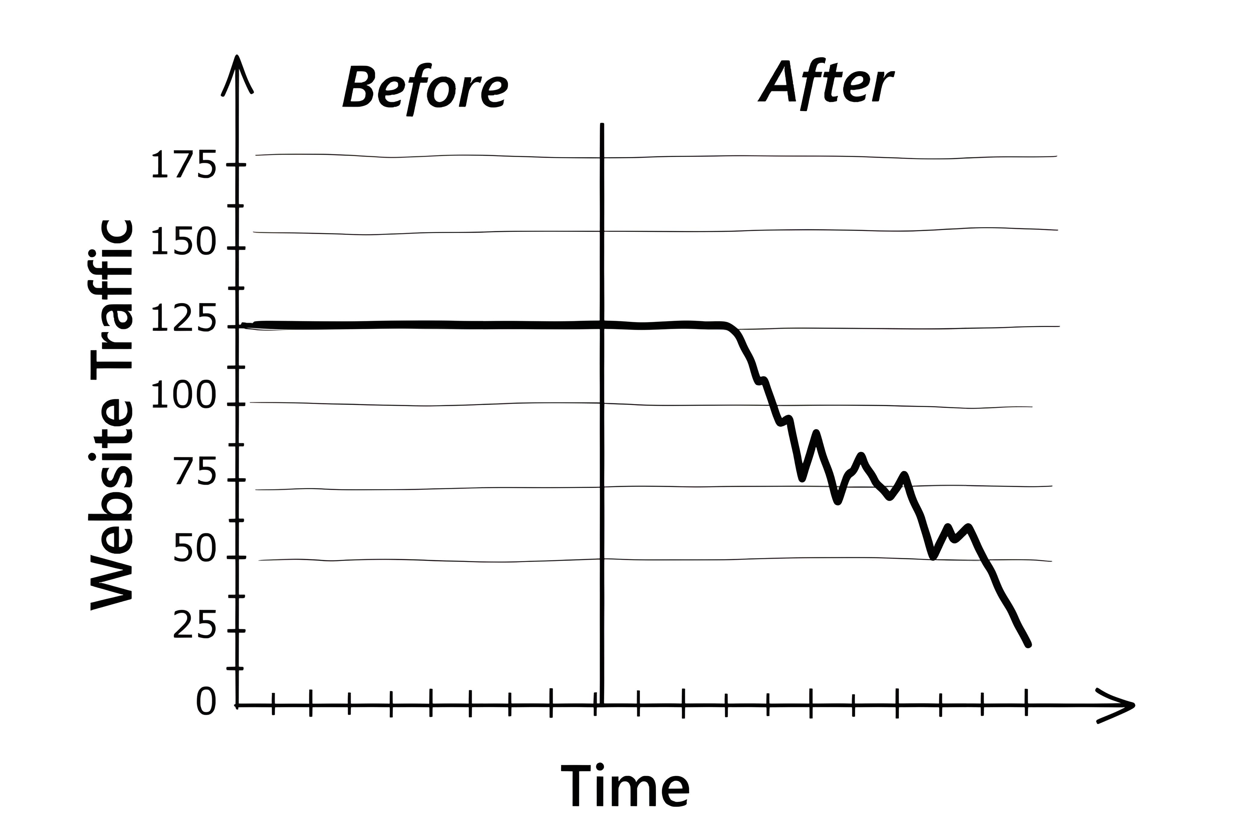
Let’s dive into nine of the most common misconceptions that drive hasty redesigns—and why acting on them without data and strategy can ruin everything you’ve worked for: A common belief is that redesigning a website involves overhauling everything all at once: the layout, the visuals, the copy, the structure. This “big bang” approach might feel satisfying, but it’s a massive gamble. Even when the motivation seems valid—improving user experience, fixing “dated” layouts, or simply matching a new brand direction—changing everything at once means you lose the ability to understand what worked and what didn’t. You also give Google no time to adapt. This can result in major drops in search rankings, reduced traffic, and even a complete disappearance from Google’s index in severe cases. Such changes can effectively wipe away years of accumulated historical data, link equity, and ranking signals, forcing your site to re-earn its place in search results from scratch. Many redesigns are driven by nothing more than the feeling that the website “looks old.” Maybe it hasn’t been updated in a few years. Maybe the layout feels uninspiring to the designer. Maybe it doesn’t match current design trends. But here’s the truth: age alone is never a valid reason to redesign. An older site might be performing exceptionally well in search, converting visitors, and offering a familiar interface to returning users. Changing it just to chase a “modern look” is a major risk—especially if the changes aren’t backed by data. A redesign motivated by design fatigue or the desire to impress stakeholders might temporarily boost morale, but it can also alienate loyal users, destroy search visibility, and tank conversions. “Glassmorphism,” “micro-interactions,” “parallax scrolling,” or the latest animation effects might be trending in design communities, but trends come and go. Besides, what works for a tech startup’s homepage might confuse or slow down your audience. Trendy doesn’t mean effective. Adding bloated scripts, animations, or unconventional layouts may actually degrade performance, especially on mobile devices, where most users browse today. Ask yourself: is the style supporting your goal, or is it just there to look impressive? Design trends should serve your audience—not distract from the message. If a trend improves usability and has been validated by your data, great. Otherwise, stick with what works. Many redesigns are influenced by the web designer’s first impression: “This site feels clunky,” “The layout is confusing,” “I don’t like the fonts.” But unless your target audience is made up of web designers, their preferences aren’t what matter most. A designer may be seeing your site with a fresh eye, but that perspective is only relevant if it aligns with your actual users. Are your users teenagers or retirees? Tech-savvy or not? Mostly male or female? On mobile or desktop? Design should serve the real audience, not someone’s personal taste. What looks “boring” to a designer might be exactly what your users find familiar and effective. Good design is empathetic and data-driven—not based on gut feelings. You might be tempted to replace an image just because it feels outdated or low-quality. But that image might be doing more work than you think—especially when it comes to Google Image Search. If it’s indexed and ranking, removing or replacing it can lead to lost traffic and visibility. It could also break backlinks or image-based links from other sites. The image might even be contributing to SEO signals tied to the page’s overall performance. Never underestimate the value of assets that are already indexed. Headings are more than just visual elements—they are vital on-page SEO signals that communicate the structure and semantic hierarchy of your content to search engines. The H1 tag, in particular, is considered the main topic of your page. If your current headings were based on keyword research, structured for clarity, and performing well in search, changing them could destroy your rankings overnight. A common error during redesigns is to rewrite headers for “style” or “voice,” ignoring the keywords they originally targeted. In doing so, you might unintentionally de-optimize your pages. If your new headings no longer contain the keywords your page previously ranked for, or if the hierarchy is illogical, Google may re-evaluate your page’s relevance and significantly de-rank it for valuable queries. Ask yourself: was this heading ranking well? Was it part of a structured SEO strategy? If the answer is yes, don’t touch it without testing alternatives and tracking results. While regular content updates are generally good for SEO, drastic changes during a redesign can be detrimental. If your old content was highly optimized for specific keywords, provided comprehensive answers, and earned valuable backlinks, overhauling it without careful consideration can break that relevance. Content that becomes significantly shorter, changes its core topic, or loses essential keywords will likely lose its ranking power. Furthermore, changes in surrounding text, internal linking, or even the subtle removal of supporting details can affect Google’s comprehensive understanding of your page’s topic, leading to unexpected declines. Maintaining existing URLs is excellent for preserving link equity and reducing redirect complexities, but it doesn’t guarantee SEO safety. Even with unchanged URLs, significant changes to the underlying code, rendering process, or internal linking structure can create new problems. This kind of caution is exactly what Google’s John Mueller recommended—even in scenarios where neither the content nor the URL structure changes. This is a perilous assumption. While Google is sophisticated, it relies on clear signals. When you change a page significantly, you’re disrupting its historical profile. Google’s algorithms will need to re-evaluate the page. In the end, it might treat redesigned pages as entirely new—causing them to lose established authority.Misconception 1:
A Redesign Means a One-Time Full RestylingMisconception 2:
The Website Should Look “Modern”Misconception 3:
The Site Should Use Trendy Styles and TechniquesMisconception 4:
A Web Designer’s First Impression MattersMisconception 5:
Replacing an Image Is HarmlessMisconception 6:
Changing Headings Isn’t RiskyMisconception 7:
Updating Content is Always Beneficial and Just Makes it “Fresh”Misconception 8:
Our URLs Are Staying the Same, So We’re Completely Safe From SEO IssuesMisconception 9:
Google Will Automatically Understand All Changes and Re-index Correctly Without Intervention
Brief recap: Website redesigns often fail because teams approach them as aesthetic overhauls instead of strategic updates. Don’t rush to change everything at once, or do it just because the site looks outdated. Trendy doesn’t always mean effective. A designer’s preferences aren’t what count—data does. Even small changes like images or headings can harm SEO. Major content edits or structural changes are risky, even if URLs stay the same. And no, Google won’t just adjust automatically. A successful redesign must be grounded in data, not guesswork or personal taste.
SEO-Vital Elements to Treat with Extreme Care
Every on-page element contributes to SEO in some way, but some carry a lot more weight when it comes to influencing search rankings and keeping users engaged. Think of these elements like fine china—fragile, valuable, and worth handling with extra care.
Here’s a breakdown of the top on-page SEO elements—ranked by priority—to treat with extra care during a redesign: The Title tag is a short piece of text that tells search engines and users what a page is about. It’s part of the HTML code of your webpage—not something people normally see on your page. Instead, it usually shows up in two places: Here’s what the code looks like: <head> Let’s say you search for “website redesign” on Google. One of the results might look like this: That top blue headline? That’s pulled straight from the Title tag (unless Google rewrites it, which it sometimes does). Remember: if the page performs well, treat its Title tag with extreme care. A Meta Description is a short summary of what a webpage is about. Like the Title tag, it’s part of the HTML code, so users typically don’t see it on the page itself. Instead, it often shows up right under the title in Google search results. Here’s what the code looks like: <head> Let’s say you search for “website redesign” on Google. One result might look like this: That second part—the little paragraph below the title? That’s pulled from the Meta Description (unless Google decides to use something else from the page). Technically, the Meta Description doesn’t directly affect your rankings in Google. But it’s still super important. Here’s why: Remember: if the page performs well, treat its Meta Description with extreme care. The H1 tag (short for “Heading 1”) is usually the main headline of a webpage. It’s part of the visible content—so unlike the Title tag or Meta Description, you actually see it on the page itself. It tells both users and search engines what the main topic of the page is. Here’s what the code looks like: <h1>Website Redesign & SEO: Avoid Traffic Drops, Keep Rankings</h1> When you land on a blog post, article, or product page, the big, bold headline at the top? That’s usually the H1. For example: Website Redesign & SEO: Avoid Traffic Drops, Keep Rankings 👆 This is the H1 that sets the stage for the rest of the content. While not a magic SEO button, a well-written H1 helps with both search engine understanding and user engagement—which is a win-win. Remember: if the page performs well, treat its H1 tag with extreme care. A URL (short for Uniform Resource Locator) is just the web address of a page—like the one you type or click to get to a website. The URL structure is how those addresses are organized across your site. It’s the layout or format of your links—how clean, readable, and logical they are. Here’s an example: https://bbcs Let’s break it down: A good URL structure helps both people and search engines: Good: https://www.example.com/blog/seo-tips ✅ Clear Bad: https://www.example.com/index.php?id=47382&cat=99 🚫 Confusing Remember: if the page performs well, treat its URL structure with extreme care. The page content—or body text—is the main part of your webpage. It’s everything a visitor can read, watch, or interact with after the page loads. In short: it’s what your page is actually about. This includes: It lives inside the HTML like this: <body> So, when someone visits your page, the body content is what they read and scroll through—it’s the meat of the page. Page content is one of the most important SEO elements. Why? Because it tells search engines and readers: Search engines like Google analyze your content to decide: If your content answers a searcher’s question really well, you’re more likely to show up high in the results. When redesigning, if your page was previously ranking for specific keywords that drove traffic and conversions, altering the content—especially removing or rewriting key phrases—can break that relevance. This happens often when content is shortened, over-simplified, or updated without regard for SEO. Even “improving” content with better grammar or readability can be risky if it involves changing or removing terms that originally helped you rank. Remember: if the page performs well, treat its content with extreme care. Internal links are links that go from one page on your website to another page on your same website. So if you’re reading a blog post and click on a link that takes you to another article, a product page, or your homepage—all within the same site—that’s an internal link. Here’s what one looks like in HTML: <a href="/bbcs-approach-principles.html" title="BBCS Approaches.">Principles behind the BBCS Redesign Approach™</a> This would link to the BBCS approach principles page on the same website. Internal links are a big deal for both SEO and user experience. Here’s why: Think of internal links as the map and pathways that guide Google and your visitors through your site. Let’s say we wanted to add here in this article a link that takes you to another article within our same website bbcs.it. We’d write: “To understand the strategy that guides every visual and structural decision, take a look at the principles behind the BBCS redesign approach™.” That blue link to the page “principles behind the BBCS redesign approach™”? That’s how an internal link would appear. Simple, helpful, and effective. Remember: if the page performs well, treat its Internal Links (and those from other pages) with extreme care. Alt text (short for alternative text) is a short description you add to an image in your website’s HTML code. People don’t usually see it on the page, but it’s there behind the scenes to describe the image. Here’s an example of what it looks like in code: <img src="https://bbcs That alt part is the alt text—it tells people (and search engines) what the image is about. Alt text plays two big roles: ✅ 1. Accessibility ✅ 2. SEO (Search Engine Optimization) Let’s say you have a page like this one with a picture illustrating the importance of safely redesigning your website by changing one thing at a time. Instead of leaving the image blank or just calling it “image1.jpg,” you write: <img src="https://bbcs That description helps both screen readers and Google understand what’s in the image. Remember: if the page performs well, treat the alt text of all its images with extreme care. H2, H3, H4, and so on are called heading tags. They’re used to organize your content into sections and make your page easier to read—for both people and search engines. Think of them like the subheadings in a book: Here’s an example: <h1>Discover the BBCS Redesign Approach™</h1> See how that creates a clear structure? Think of headings like road signs that guide both your visitors and search engines through your content. Remember: if the page performs well, treat its H2, H3, etc. with extreme care.🏷️ 1. Title Tag
<title>Website Redesign & SEO: Avoid Traffic Drops, Keep Rankings—BBCS Redesign Approach™</title>
</head>📍 Where You See It in Real Life
🔍 Why the Title Tag Matters for SEO
📝 2. Meta Description
<meta name="description" content="Thinking of Redesigning Your Website? THINK AGAIN—It Could Cost You Everything on Google! Learn how to apply the BBCS Redesign Approach™ to redesign your website without losing SEO rankings.">
</head>📍 Where You See It in Real Life
🔍 Why the Meta Description Matters for SEO
🏷️ 3. H1 Tag
📍 Where You See It in Real Life
🔍 Why the H1 Tag Matters for SEO
🔗 4. URL Structure
🧭 Why URL Structure Matters
✅ For users:
✅ For Google:
🔍 Good vs. Bad URL Structure
✅ Descriptive
✅ Easy to read
🚫 No context
🚫 Hard to remember or share🧾 5. Page Content
<h1> ... </h1>
...
<h2>SEO-Vital Elements to Treat with Extreme Care</h2>
<p>Every on-page element contributes to SEO in some way, but some carry a lot more weight...</p>
...
</body>🔍 Why Page Content Matters (a lot!)
🔗 6. Internal Links
🧭 Why Internal Links Matter
✅ For your visitors:
✅ For search engines (like Google):
📚 Real-Life Example
🖼️ 7. Image Alt Text
👩🦯 Why Alt Text Is Important
If someone is blind or visually impaired and using a screen reader, the alt text is what gets read out loud to them. It’s how they “see” the image.
Google and other search engines can’t “see” images like humans can—at least, not yet. They rely on alt text to understand what the image is showing. If it’s well-written and relevant, it can help your images appear in Google Image Search and improve your page’s overall SEO.🔍 Real-Life Example
🏷️ 8. Header Tags (H2, H3, etc.)
...
<h2>Step 1: Identify What’s Working</h2>
...
<h3>High Search Engine Rankings</h3>
...
<h3>Consistent Organic Traffic</h3>
...
...
<h2>Step 2: Protect What’s Already Working</h2>
...
<h2>Step 3: Change One Thing at a Time</h2>
...📚 Why Heading Tags Matter
✅ For readers:
✅ For search engines:
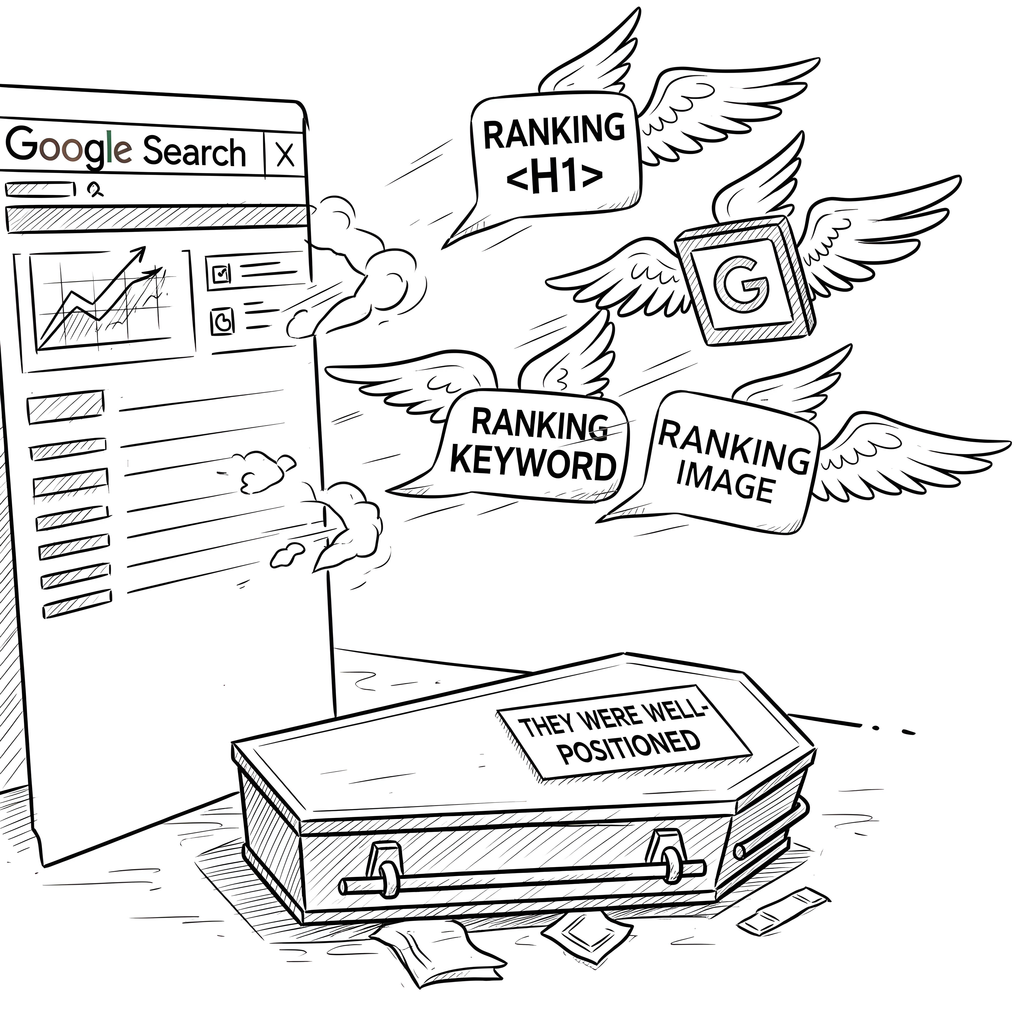
Brief recap: Certain elements of your site carry heavy SEO weight and should never be altered casually during a redesign. These include: title tag, meta description, headings, URL structure, page content, internal links, and image alt text. Each of these helps search engines understand and rank your content—and changing them without a clear, data-backed reason can lead to traffic loss. Treat these components with extreme care: preserve what works, adjust only when useful, and always test before deploying.
How to Safely Redesign Your Website
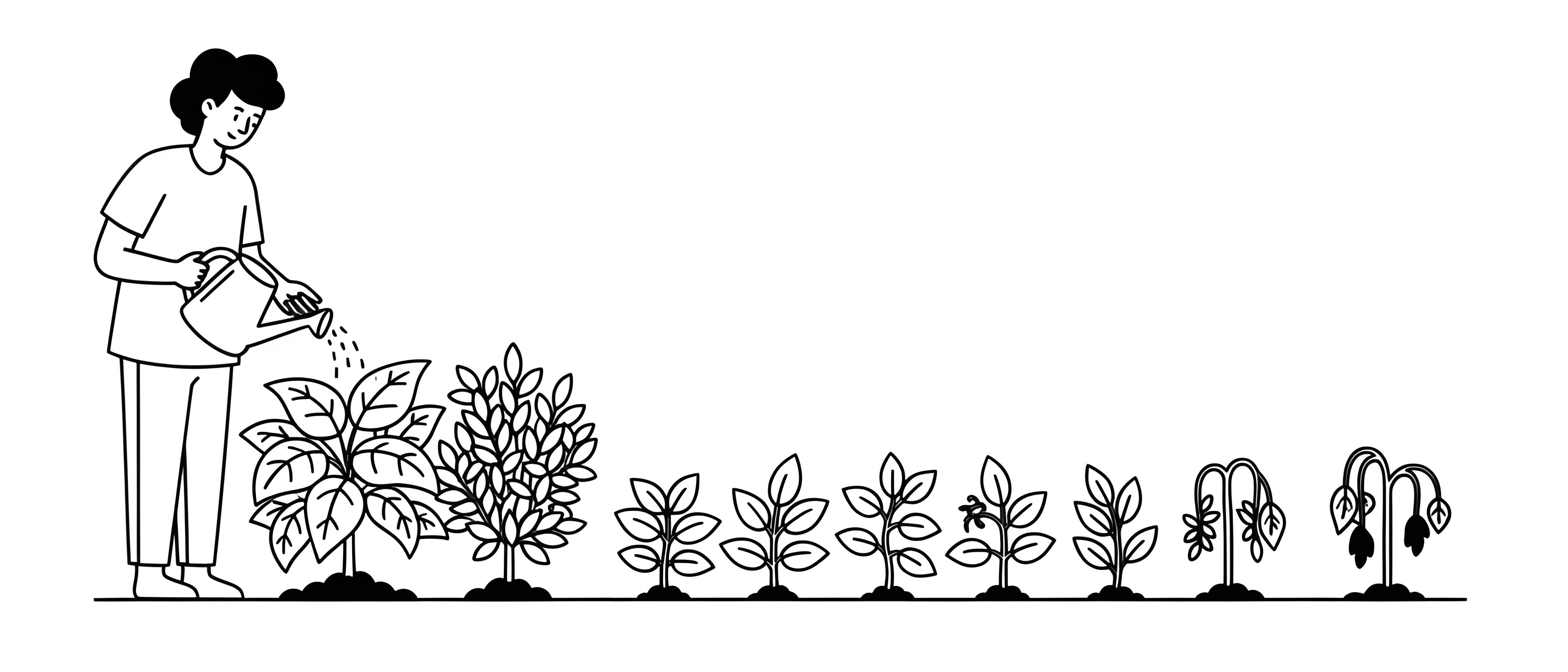
Of course, this doesn’t mean you can’t ever change your site. Updates are sometimes necessary. But they need to be done smartly. The following is based on the BBCS Redesign Approach™—a proven methodology designed to ensure your redesign improves performance rather than harming it. Here’s how it works: Before you touch a single pixel or line of code, you need to know what your website is already doing well. That means looking at actual results—not just how the site looks or feels, but how it performs. Ask yourself: Is it ranking well on Google? Mentioned in AI Overviews? Bringing in leads? Making sales? Getting repeat visitors? Here are 14 real-world signals that show your website is pulling its weight. Even if just a few of these are strong, it’s a sign you’ve got something worth protecting. Ultimately, this is the strongest sign: your website is bringing in money. Whether it’s product sales, bookings, subscriptions, or services—sales = success. A website that convinces visitors to take action—subscribe, fill out a form—is doing its job. Strong sites convert traffic into value. If a page ranks on the first page of Google, especially in the top 3 spots or in any AI answer, it’s considered a top performer. This shows the content is optimized, relevant, and trusted by Google. Getting steady traffic from Google and other search engines over time means your site is being found naturally—without paying for ads. That’s a key sign of a healthy, discoverable site. If people land on your site and leave immediately, that’s a bad sign. A low bounce rate (depending on the page’s purpose) means visitors are finding what they expected—and staying to explore. Metrics like time on page, pages per session, or scroll depth show that users are truly interacting with your content—not just clicking and leaving. If people see your page in search results and actually click on it, that’s a good sign your Title tag and Meta Description are doing their job. If users come back to your site regularly, it means you’re providing ongoing value—through content, product offerings, or brand trust. If you’re running ads (Google Ads, social media, etc.) and your site turns that traffic into profitable conversions, it means it’s working well with your marketing efforts. If people search for your business name or land on your site directly (no referral), that’s a sign they already know and trust your brand. If people are sharing your content or linking to your site from theirs, that’s powerful social proof and can help drive traffic and boost SEO. Real feedback—either through surveys, reviews, or spontaneous praise—means your site is doing what it’s supposed to: helping real people. Google’s metrics like loading performance, interactivity, and visual stability of the page matter for rankings and user experience. Scoring well here means a strong technical foundation. If you’re tracking steps in a buying or sign-up process (a sales funnel), a low drop-off rate means people are completing the journey, not quitting halfway through. If you realize that nothing is working (sorry about that 😔), you might want to stop here and consider replacing your website entirely. BBCS Websites can help you make things better. Contact us. Fine, it seems you’re still reading. That means your website is performing well on at least a few important points. Well done! Now that you’ve identified what your website is doing right, don’t rush to change it. A redesign might seem exciting or overdue—but if it puts at risk the results you’re already getting (like rankings, traffic, or conversions), it could do more harm than good. Before moving forward, ask yourself: If your site is performing well in key areas, consider improving around the edges instead of wiping the slate clean. At the very least, make sure any redesign plan includes strategies to preserve your current SEO performance, user flow, and conversion paths. Sometimes the smartest move is not a full redesign but a smart evolution. So you’ve decided a redesign is worth the risk. Great—but now, go slow. Don’t change everything at once. If you update the layout, rewrite the content, and swap out the SEO tags all in one go, how will you know what worked—or what backfired? Instead, change one thing at a time—the layout or the content or the Title tag—and give it a little time to see how it performs. Then ask: Did rankings drop? Did conversions go up? Are people clicking more or staying longer? Here’s how to measure the impact of each change: By now, you’ve tested a few changes and seen what actually made a difference. Some updates improved performance—maybe a cleaner layout boosted conversions, or a more focused headline led to more clicks. Now it’s time to lock in those wins. Once something works, make it the new standard for that page. This prevents backsliding and ensures you’re consistently delivering a better experience. Keep notes. Save the results. Document what changes you made, what worked, and what didn’t. It’ll make future updates faster, easier, and far less stressful. Don’t stop at a single win. Look for ways to apply what worked in one area to other parts of your site—carefully. Ask yourself: This step is about building momentum. But always validate before assuming success will translate—what works in one context might not in another. Test, observe, and adapt. Even after you’ve tested and launched your updates, your work isn’t done. Now’s the time to keep a close eye on how the site behaves in the real world. Sometimes a change that seemed smart in theory has side effects you didn’t expect—like a dip in search rankings, a drop in mobile speed, or confused users not finding what they need. Here’s how to stay on top of things: Think of this step like checking your mirrors after changing lanes. You might be on the right track—but it never hurts to make sure. Redesigning a website without losing performance isn’t just about how it looks—it’s about how it’s found, how it functions, and how it converts. Even if you’re handling things well so far, an experienced SEO expert can bring a fresh set of eyes, spot risks you might miss, and help you make smarter, faster decisions. An expert can: If SEO is critical to your business (and it often is), it’s worth having someone in your corner who lives and breathes this stuff. This is exactly what the BBCS Redesign Approach™ is designed for: protecting what works, improving what doesn’t, and guiding you through smart, SEO-safe changes. Contact us if you’d like to talk about your website’s next move.Step 1: Identify What’s Working
👍 1. Revenue Generation
How to measure:
👍 2. Lead Generation
How to measure:
👍 3. AI Mentions and High Search Engine Rankings
How to measure:
👍 4. Consistent Organic Traffic
How to measure:
👍 5. Low Bounce Rate
How to measure:
👍 6. High Engagement
How to measure:
👍 7. Strong Click-Through Rate (CTR)
How to measure:
👍 8. Returning Visitors
How to measure:
👍 9. Positive ROI from Paid Campaigns
How to measure:
👍 10. Strong Brand Awareness
How to measure:
👍 11. Social Shares and Referrals
How to measure:
👍 12. Positive User Feedback and Testimonials
How to measure:
👍 13. Good Core Web Vitals
How to measure:
👍 14. Low Drop-Off in Funnels
How to measure:
Step 2: Protect What’s Already Working
If not, a full redesign might be unnecessary. Sometimes small tweaks go further than big changes.
Redesigns driven by “it looks outdated” or “we just want something fresh” can lead to costly mistakes if not backed by data.
That top-ranking blog post, that product page that brings in leads, or that high-converting layout—these might not survive a full overhaul unless you’re careful.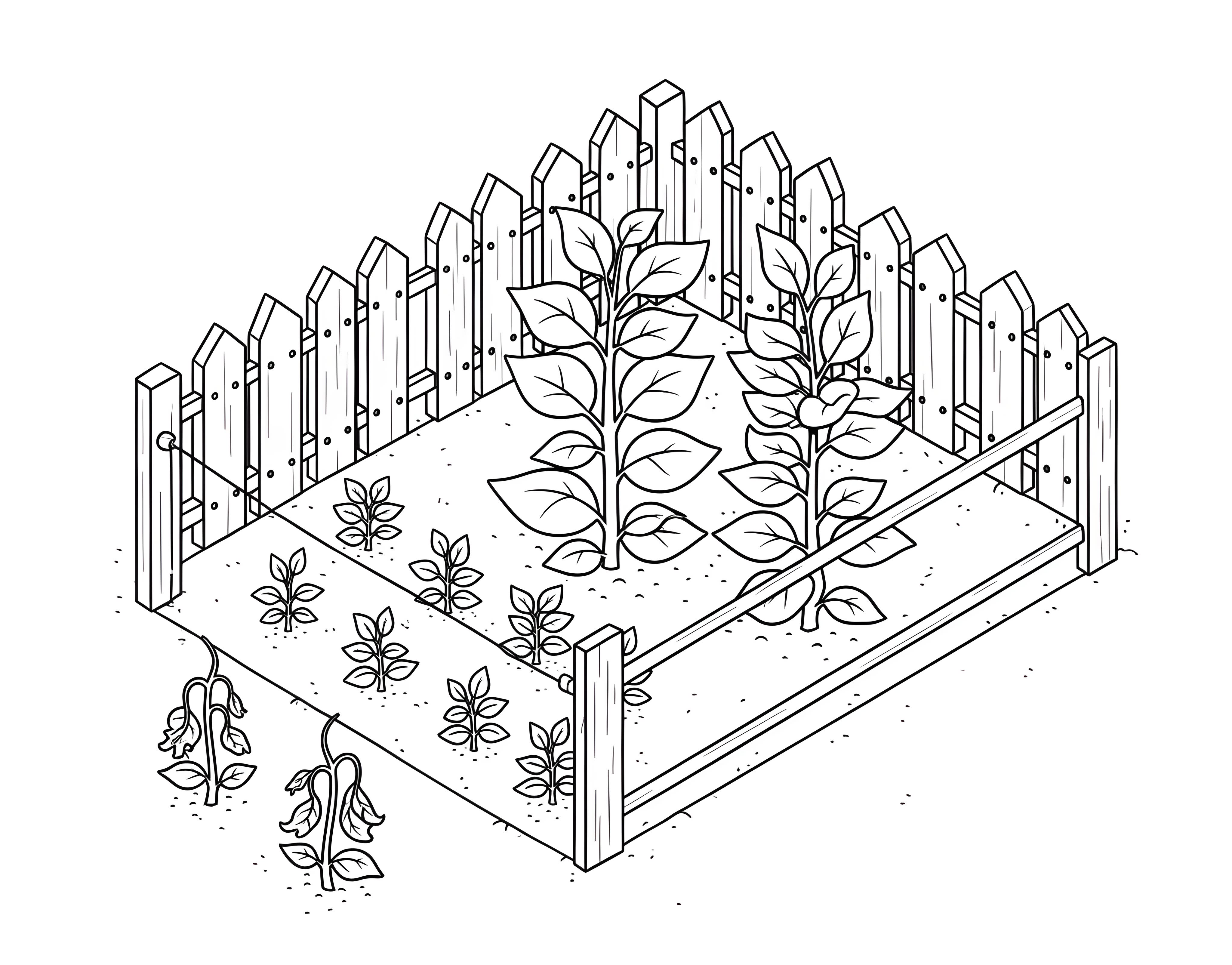
Step 3: Change One Thing at a Time
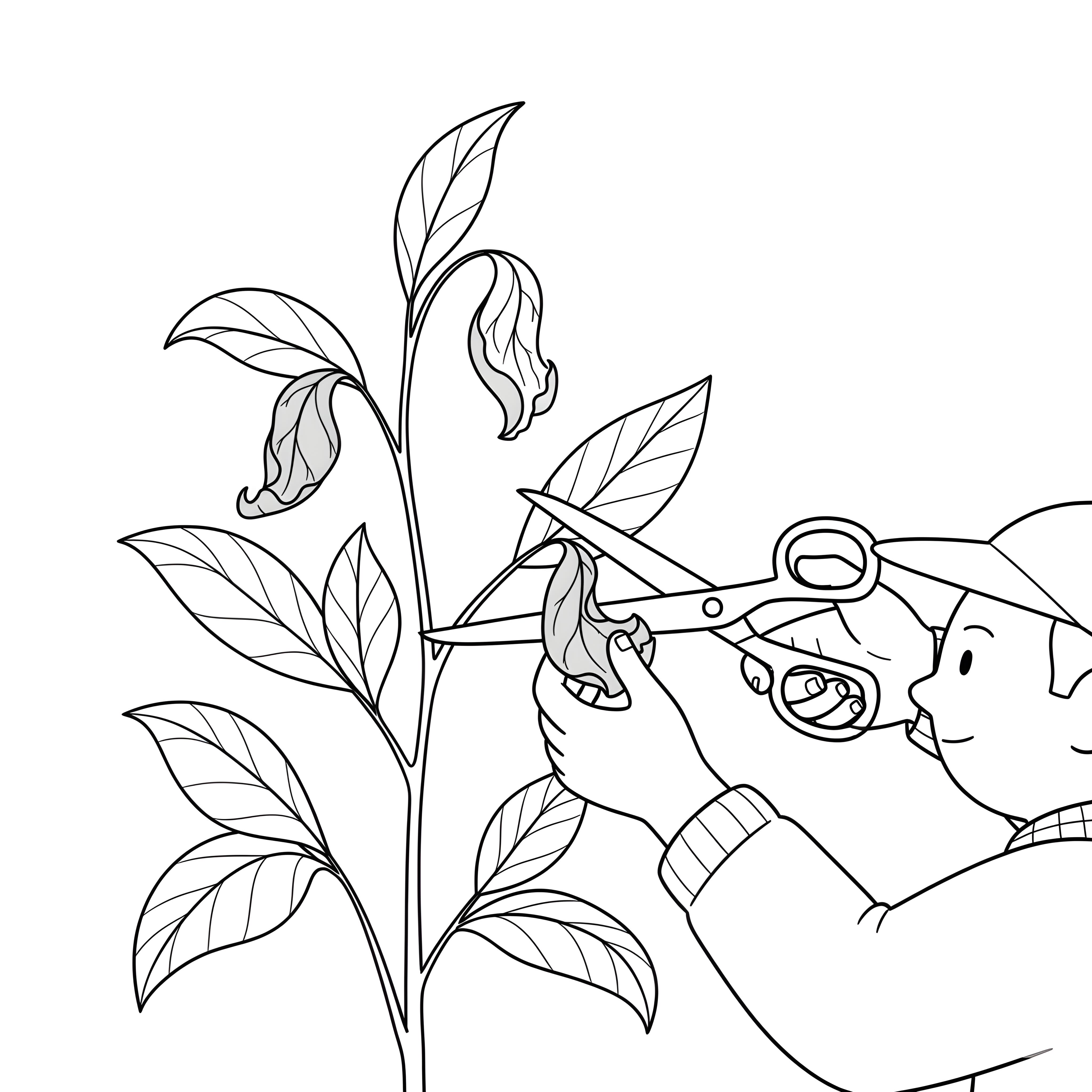
Check for changes in traffic, bounce rate, time on page, and conversion rate. Look at trends before and after the change.
See if impressions, average position, or click-through rates go up or down for the page you changed.
If the page is meant to drive leads or sales, track form submissions, purchases, or any other key action.
Keep a simple log of what you changed and when. Even a basic spreadsheet helps you connect changes with outcomes.
Most changes need at least a week or two (sometimes more) to show clear patterns. Don’t rush to judge.
If you have enough traffic, you can run an A/B test—where half your visitors see version A and the other half see version B. It’s a great way to find out what actually works, without guessing.
Tools like VWO, Optimizely, or even built-in options from platforms like WordPress or Shopify make this easier than you’d think.Step 4: Keep What Works

Step 5: Apply It Elsewhere (with Caution)

Try rolling it out to other product pages.
Apply that same tone or structure to other high-traffic pages.
See where else you can simplify things.Step 6: Monitor Closely After Changes

Look for sudden changes in traffic, bounce rate, or conversions. Compare before and after.
Rankings can shift unexpectedly after changes, especially if you’ve edited Title tags, headings, or page structure.
Ask customers or colleagues for feedback. Are they finding what they need? Are they confused by anything?
Double-check how everything looks and works on mobile, tablet, and different browsers. Something as small as a shifted button can hurt conversions.
Don’t just look once. Set a reminder for 1 week, then 1 month, to compare progress.Step 7: Consider Working with an SEO Expert

Brief recap: A safe website redesign means following a disciplined, data-backed process like the BBCS Redesign Approach™:
- Step 1: Identify what’s already working.
- Step 2: Protect it.
- Step 3: Change one thing at a time to isolate effects.
- Step 4: When a change improves performance, lock it in—make it the new standard and document what worked to guide future updates.
- Step 5: Cautiously reuse what works elsewhere.
- Step 6: Monitor performance closely after changes.
- Step 7: Involve an SEO expert when in doubt.
Why Some Say “Just Redesign It All”
Some people skip the cautious, step-by-step approach and go straight for a full overhaul. It’s not always reckless—it usually comes from a place of urgency, excitement, or pressure. Here are some of the most common reasons behind that mindset, and what you can do instead to meet the same goals without risking what already works.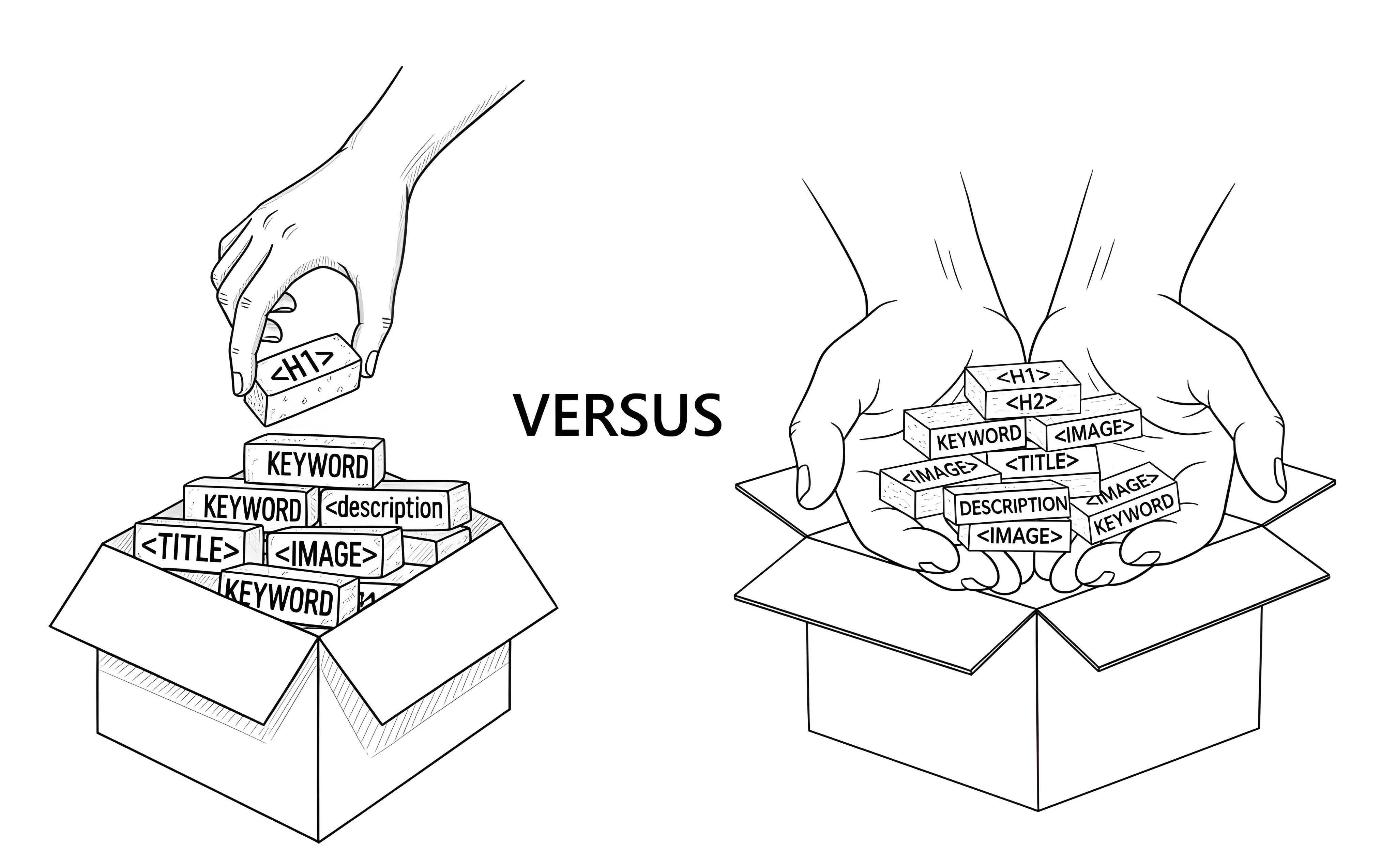
Each reason may sound familiar—and valid. But with a bit more planning, you can keep what’s working, improve what’s not, and avoid unintended setbacks. Some see a redesign like hitting the reset button. They feel the current site is outdated, messy, or off-brand, so they’re tempted to throw everything out and start clean. The risk: You might throw away elements that are quietly working—like search rankings or strong conversion copy. A smarter way: Get your fresh start in stages. First, identify and keep what’s working (even if it’s hidden under an outdated look). Then redesign around those strengths. You still get a clean, modern site—but with proven performance built in. Stakeholders want everything done by a specific launch date. That leads to rushing and doing everything at once—design, content, SEO, UX—all bundled together. The risk: A rushed launch can lead to SEO loss, broken links, and user confusion that’s hard to recover from. A smarter way: Launch in phases. Focus first on key pages or sections—those that matter most to your business. Let the rest follow after testing and fine-tuning. You stay on schedule and reduce the risk of hidden damage. In cases of full rebrands or company mergers, everything does need to change—from visuals to tone to structure. It can feel easier (or more aligned) to relaunch all at once. The risk: You might lose existing traffic or trust built around the old structure. A smarter way: Plan a guided transition, not a sudden switch. Redirect old URLs carefully. Retain top-performing content and reshape it to match the new brand. Keep users and search engines oriented as you gradually evolve your identity. If they haven’t tracked performance, they assume nothing’s working—and so they feel free to rebuild from scratch. The risk: You might be missing subtle successes—like a page that ranks well or a layout users respond to. A smarter way: Run a quick audit before wiping the slate clean. If there truly is nothing worth saving, you’ll know—and you can move forward with a bold redesign confidently. But if there is something working, now you can protect it. A business owner sees a competitor launch a flashy new site and decide to follow suit. The risk: Every site has different strengths and goals. What works for one site might not work for yours. A smarter way: Take inspiration from others, but test with your own users and data. You can absolutely refresh your site to look modern and competitive—just do it while keeping an eye on your unique goals and audience behavior. Some truly believe the new design is so much better that it must perform better. The risk: Design and performance aren’t always aligned. Even great-looking changes can unintentionally hurt usability, SEO, or conversions. A smarter way: Test the new design in parts—on a few pages, or with A/B testing if you have the traffic. Let the results guide you. This builds confidence in the new look and ensures it’s helping your business, not just looking good.1. “We want a fresh start.”
2. “We’re under pressure to launch everything by a deadline.”
3. “We’re rebranding or merging.”
4. “Nothing seems to be working anyway.”
5. “We saw someone else do it—and it looked great.”
6. “The new design is clearly better.”
Brief recap: Some advocate for a full redesign for reasons like wanting a fresh start, tight deadlines, rebranding or merging, fixing underperforming sites, copying others’ successful designs, or simply because the new design looks better. However, these motivations often overlook the risks involved in overhauling what might already be working. Fortunately, there is a smarter, safer way to address these needs without putting existing performance at risk.
Real-World Case Studies: The Danger Is Real
It’s easy to dismiss warnings about redesign risks as theoretical. But when you look at real-world examples, the picture becomes much clearer—and more alarming. The following cases are not hypothetical. They involve well-known brands that invested heavily in redesigns, only to face user backlash, plummeting traffic, or even long-term damage. Of course, very few companies publicize their own failures, especially in design-driven industries. But the evidence is out there, and it’s sobering. On February 7, 2011, Gawker and its sister sites—including Gizmodo, Lifehacker, Jezebel, and Deadspin—rolled out a dramatic redesign. The results were immediate and devastating. Gawker’s U.S. daily unique visitors dropped from 561,000 to 257,000, while Gizmodo saw a similar plunge, from 746,000 to 420,000. According to Sitemeter data, the actual traffic drop may have been even more severe. Overall, Gawker’s network experienced an 80% drop in total traffic right after the redesign, and a 50% decline over the following two weeks. Many users complained about the unfamiliar interface and poor usability, voicing their frustration in the comment sections. The outcome was a catastrophic loss of visibility and engagement—an outcome that underscores just how risky large-scale redesigns can be when they are not supported by thorough user testing and SEO planning. Digg’s infamous 2010 redesign—known as “v4”—is a cautionary tale in the tech world. The social news site saw mass user defection almost overnight. According to Computerworld, U.S. traffic dropped 26%, while the U.K. audience fell by 34%. The redesign triggered widespread backlash. The Guardian reported a user revolt, with power users staging a “Quit Digg Day” and flooding the platform with Reddit links. The Atlantic confirmed a steady traffic decline in the weeks that followed. In a Wired interview, a former top contributor stated plainly: “Digg bled users and traffic” due to the alienating redesign. Retail giant Marks & Spencer spent £150 million and two years revamping its online store. Unfortunately, the results didn’t meet expectations. As The Guardian reported, online sales dropped by 8% in just three months post-launch. Shareholders were not pleased—and neither were customers. Negative feedback poured in. One user wrote: “Hate the new website as it is so tricky to use,” while another declared, “Refuse to shop online as the website is the most user-unfriendly and awkward to navigate.” The overhaul, intended to modernize the user experience, ended up driving users away. StumbleUpon, a once-popular content discovery platform, introduced a major redesign in December 2011. According to the Wikipedia entry, the platform added new features and UI components, like the “Explore Box”, while removing long-standing elements such as user-generated blog content. The backlash was swift: within a month, overall site traffic declined by 25%. Users criticized the new interface for being confusing and unfamiliar, and the loss of older content alienated long-time fans. The attempt to reinvent the platform ultimately contributed to its decline in relevance and engagement. Not every redesign failure makes headlines, but platforms like Reddit’s r/bigseo and Google’s official forums are filled with real-world stories from professionals who learned the hard way. One such Reddit user explained how multiple sites they worked on lost significant traffic after a redesign. Despite implementing redirects from old URLs to new ones, they also removed a substantial amount of content, leading to what they described as effectively starting from scratch in Google’s eyes. The user attempted to reintroduce frequently used keywords, but was left wondering how to measure the traffic loss and recover from the setback. Another anonymous SEO professional shared their experience of working with a local banking client who suffered a 64% drop in direct traffic and a 60% drop in branded organic traffic following a large-scale redesign of their 500-page website. Even though 301 redirects and META data were properly migrated and server errors were minimal, the damage had already been done. Their story highlights that even technically “correct” redesigns—on paper—can cause major traffic losses if deeper SEO factors or user signals are disrupted. In a Google Search Central support thread, another user described a drastic traffic drop after redesigning a client’s site and updating SEO elements. They questioned whether changing meta titles, descriptions, content style, and design could negatively affect already ranked pages—and the answer is yes. When well-performing metadata or familiar layouts are altered without preserving their SEO value, it can confuse search engines, reduce click-through rates, and ultimately harm rankings. This report serves as a reminder: successful pages should evolve carefully, not be rewritten from the ground up without strategic continuity. We can only speculate about the anonymous professionals who shared their stories on Reddit and Google support, but when it comes to the high-profile failures listed above—from Gawker to Marks & Spencer—one thing is certain: these weren’t amateur efforts. These companies didn’t hand off their redesigns to someone’s “tech-savvy nephew.” They almost certainly hired top-tier agencies and seasoned professionals to carry out the work. And yet, the outcome was still disastrous. That’s the most sobering lesson of all. If major organizations with access to top resources, research, and design talent can make catastrophic mistakes during a website redesign, then no one is immune. Reputation, budget, or technical capability alone does not guarantee a successful outcome. Remember: the danger is real. A redesign is not just a visual upgrade—it’s a strategic minefield that affects SEO, user behavior, traffic flow, and business goals. That’s why we created the BBCS Redesign Approach™: a step-by-step framework that helps reduce risks, preserve search visibility, and keep what works while improving what doesn’t. Because even the best companies can get it very wrong—unless the process is handled with humility and precision.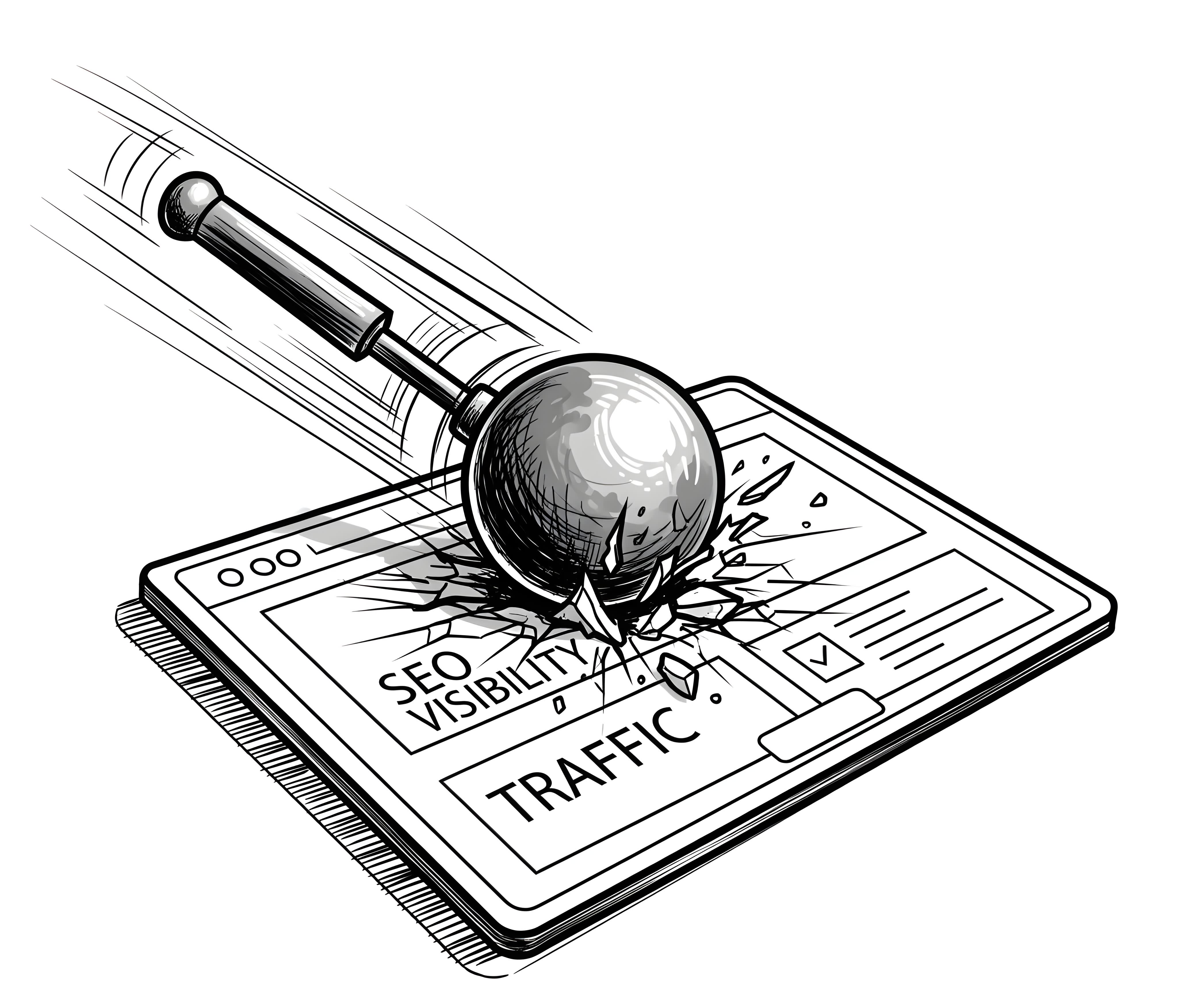
Case Study #1: Gawker Media Redesign (February 2011)
Case Study #2: Digg v4 Redesign (August 2010)
Case Study #3: Marks & Spencer E-Commerce Redesign (2014)
Case Study #4: StumbleUpon Redesign (December 2011)
Case Study #5: Anonymous Reports from Reddit and Google Support
Lessons for Us
Brief recap: Real-world examples like the Gawker Media (2011), Digg v4 (2010), Marks & Spencer E-Commerce (2014), StumbleUpon (2011) redesigns, along with reports from Reddit and Google Support, highlight the serious risks of careless website redesigns. These case studies show how well-intentioned changes can lead to dramatic traffic drops and lost SEO value.
The “DeLorean” Solution
Among the many stories shared in online forums, one recurring theme stands out: the mix of panic, regret, and utter confusion that often follows a poorly executed website redesign. These aren’t rare cases—they’re alarmingly common. One Reddit user, having just watched their traffic vanish after a redesign, posted a desperate plea for help. The sense of urgency was real, the despair almost tangible.
But then came a reply that perfectly captured the mood—half hilarious, half heartbreakingly accurate. The advice?
- Get a Delorean
- Go 88 mph in a mall parking lot
- You know the rest...
Credit to u/bradatlarge for the brutally honest humor.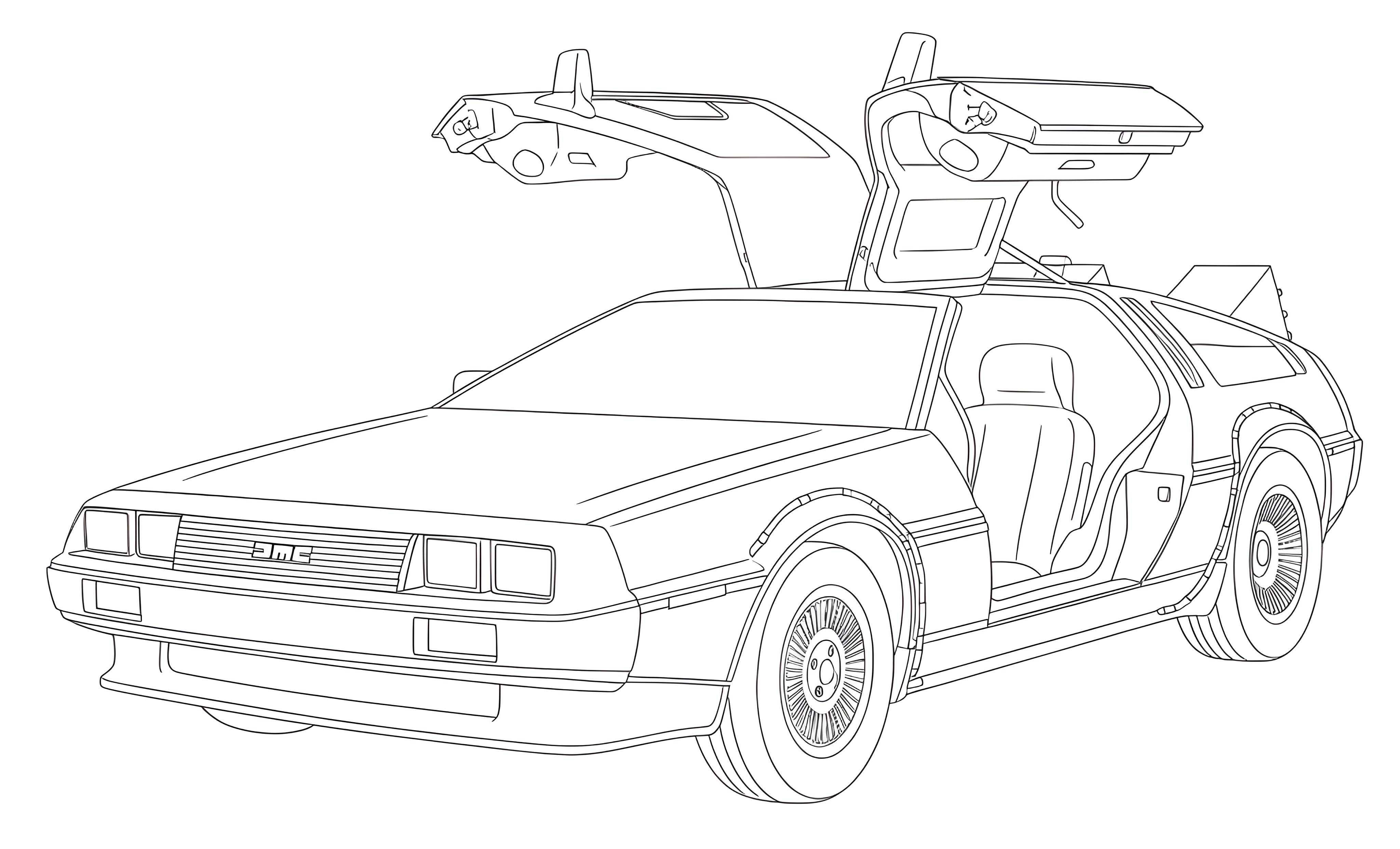
It was a tongue-in-cheek reference, of course, to the time-traveling car from Back to the Future. But behind the joke lies a serious truth: when a redesign wipes out traffic, visibility, and business results overnight, it really can feel like the only solution is to go back in time and undo the damage. It’s a feeling many professionals—yes, even experienced designers—have expressed when faced with the consequences of SEO-ignorant decisions.
There’s no magic reset button. And unlike Hollywood, you don’t get a second take. One oversight, one missing redirect, one hasty decision to scrap useful content can have ripple effects that last for months or even years. It’s like tearing down your house just to repaint the living room—or formatting your hard drive because the wallpaper was outdated.
These kinds of disasters are exactly why careful, informed planning matters. It’s why SEO must be part of the redesign conversation from day one—not an afterthought. And it’s precisely what the BBCS Redesign Approach™ is designed to prevent. We help ensure you won’t need a DeLorean... just a solid plan.
P.S. If you’ve already made costly mistakes, don’t panic—switching back to the old site might be your smartest move. BBCS doesn’t have a DeLorean, but you do. Roll things back now, and we’ll help you move forward the smart way—with the BBCS Redesign Approach™.
Bad Redesign Advice You’re Exposed To
If you search for “website redesign” on YouTube—as I did, incognito, on June 12, 2025—you’re guaranteed to find tutorials, walkthroughs, and redesign showcases by popular creators. The problem? Much of what’s recommended in these videos ranges from SEO-ignorant to downright reckless when applied to a live, indexed website. Let’s take a closer look at some of the top-ranked videos and examine the advice they offer. Brunton judges the original site purely on looks: “I’m going to break down this real live site. ... What I think we have really is a website that lacks a lot of visual appeal. It’s just kind of boring. We want to give it more life.” Mistake 1: He changes the headline and merges the original headline and byline into one new sentence, saying: “By using this headline 'Peak website performance' it’s clear that Peak Performance that repetition, that alliteration, uh, it just really sticks so much quicker in that nanosecond within the mind of the reader. The same with this byline. I wanted this to be more of a nice readable sentence, more like prose, so now I’ve combined their headline and their byline into this one sentence in plain English.” All without any keyword analysis. Mistake 2: He says: “All that detail about estimating return on marketing investment and SEO and all this kind of thing, they can get into that through their website.” Removing such content—likely rich in keywords and business relevance—can cause irreversible SEO damage. Beard focuses on redesigning a homepage for a coffee house and admits: “One of the most important things is to make sure that we get a photo that really, um, brings across the energy that we want to. What I think my favorite photo was this is what I really liked.” Mistake 1: Choosing images based on personal taste, not user behavior or performance data. A site isn’t designed for the owner or the designer—it’s for the user. Mistake 2: She says: “So I came up with 'everyone’s favorite pull-off'. It’s kind of fun.” This kind of subjective tagline creation ignores keyword research entirely. Would anyone search for that? Mistake 3: She states: “I do want to include this little blurb because um even if it’s not this exact blurb a lot of times it’s good to include a paragraph just for SEO purposes.” This shows a fundamental misunderstanding of SEO. Including text “just because” without strategy can hurt more than help. In the video, Segall says: “This is kind of like a boating or Port Services”—which means he doesn’t even fully understand the site’s subject before starting the redesign. Mistake 1: He replaces the original image simply because, as he says: “uses orange and blue, color which almost looks like the brand color.” Image changes without SEO consideration (e.g. file names, alt text, prior image performance) can hurt rankings. Mistake 2: On value propositions, he says: “I found this one: 'Creative and Cost Effective Transport Solution First Rate Storage Facilities' so let’s use that.” Again, no keyword analysis or user testing—just a personal pick. Mistake 3: When simplifying the layout, he says: “I’m going to break down the next section... it’s too much to show.” But was the original content truly “too much”—or simply essential to search performance? Here, he redesigns a beverage site and says: “I’m actually confused as to what is this drink to begin with. Actually don’t really know what this is.” Mistake 1: Despite not understanding the product, he still goes on to change key SEO elements like the headline. Mistake 2: He demotes the strong “summer sale” phrase from heading to button: “We’ve added the summer sale because obviously knowing that we have a sale right now is important, right? So we’ve added that in a text to the actual main call to action button.” But a button doesn’t carry the same SEO weight. Mistake 3: He justifies the headline change saying: “I don’t really know what this thing is. So I think we can have a more powerful definition or a headline here.” That’s designer-centered thinking—dangerous in a redesign context. These videos, often created by talented and well-meaning designers, show a shocking disregard for SEO when it comes to live websites. In most cases, the changes are visually appealing—but we’re not talking about new sites. We’re talking about redesigns. And that changes everything. You can’t treat a live, indexed site as a blank canvas. You can’t just assume the original content has no value. Maybe the existing page was ranking #1 in Google. Did anyone check? If it was buried at the bottom of the index, then yes, redesign away. But if it was performing well, replacing it on a hunch is reckless. The truth is, most of these videos rank highly because their audience consists mostly of designers and developers looking for visual inspiration. The advice they give often works brilliantly for new websites—but not for redesigns of established ones. To be clear, I often like the visual improvements they make. But liking a design is not the same as validating it with user behavior and SEO performance. You’re not starting from zero—you’re working with something alive and potentially successful. In redesigns, the core rule is simple: leverage what is working. Build on it, don’t destroy it—because what works is the result of hard work. In redesigns, the core rule is simple: leverage on what is working. Build instead of destroy. Because what is working has been the result of hard work. The biggest pitfall? Designers tend to work from instinct—what they like, what they feel. That’s a dangerous approach. Dear Designer: your feelings don’t matter here. What matters is how real users behave, what they value, and what already works. Maybe your new image, layout, or headline really is better. But until that’s tested and validated, replacing the old one is a gamble. Redesigns are delicate. Even if the original website had flaws, charging in with the assumption that every change will be an improvement is misguided. And no, saying “you’ll see the benefits in the long run” doesn’t count. This is business. A redesign should protect the client’s investment—not risk it for the sake of aesthetics. That’s exactly where the BBCS Redesign Approach™ comes in. We don’t redesign for the sake of it. We redesign with data, with search in mind, and above all, with respect for what already works.Video 1: Website Redesign: Good to Great – Matt Brunton
Video 2: Small Business Website Redesign – Maddy Beard
Video 3: From Vintage to Modern Website Redesign – Ran Segall
Video 4: Website Redesign #3 | Clean and Premium – Ran Segall
Lessons for Us
Brief recap: Many popular redesign advice videos focus on visual appeal but neglect SEO, often leading to harmful changes on live sites. Designer-centered decisions without SEO validation risk damaging search rankings and user engagement.
Frequently Asked Questions
How do I redesign an existing website?
The BBCS Redesign Approach can be summarized as:
- Step 1: Identify What’s Working – Use data to determine which pages, keywords, and features are performing well.
- Step 2: Protect What’s Already Working – Don’t break what’s helping; preserve rankings, content, and structure.
- Step 3: Change One Thing at a Time – Avoid chaotic shifts; isolate changes to track results clearly.
- Step 4: Keep What Works – Recognize strong elements and retain them during the redesign.
- Step 5: Apply It Elsewhere (With Caution) – Carefully reuse successful patterns without assuming universal success.
- Step 6: Monitor Closely After Changes – Watch traffic and engagement metrics immediately after updates.
- Step 7: Consider Working with an SEO Expert – A specialist can help protect your visibility and avoid costly mistakes.
How often should a website be redesigned?
A redesign should only happen when data shows it’s needed—not on a fixed schedule. Signals include declining traffic, user engagement issues, outdated content structure, or technological obsolescence. Frequent minor improvements are better than sweeping overhauls. Redesigning without evidence or clear goals risks more harm than good.
Does my website need a redesign?
It might—if there’s a measurable drop in organic traffic, user retention, or conversion rates. But the decision must be data-driven. Use tools like Google Analytics, Search Console, and heatmaps to evaluate performance. A site that looks old might still perform exceptionally well. The redesign should fix real issues, not just visual preferences.
How do I modernize my website?
“Modernizing” doesn’t mean replacing everything. Instead, keep what works—especially pages that rank and convert—and modernize gradually. Improve speed, accessibility, and mobile usability. Update design without disrupting content or structure. Use controlled testing and validate each change with real data to avoid unintended SEO losses.
Does redesigning a website affect SEO?
Yes—and often negatively, if not handled with care. Changing URLs, titles, content, or structure without safeguards can destroy years of SEO equity. This page outlines real-world cases where traffic collapsed after careless redesigns. SEO must guide the redesign—redirects, metadata preservation, content continuity, and staging environments are essential to avoid disaster. That’s why the BBCS Redesign Approach exists—to prevent these costly mistakes.
How much does it cost to redesign a website?
The cost of the Preliminary Analysis is €180 plus €5~6 per web page. The final cost of the actual redesign depends on the current health of your website. The healthier the website is, the fewer modifications it will require, and the more cost-effective the redesign will be for you. Ultimately, you will only pay for what you truly need to achieve your goals.


Share this page:
As an alternative to the buttons above, you can select the following address, and copy/paste it into the message to send on your favorite social network:
https://bbcs.it/en/how-to-build-a-professional-website/seo/website-redesign.html